Letter AAA - by Vincent van Gogh
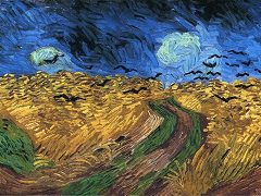
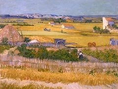
But what has struck me most in the natural scenery recently, I have not yet started, because of the lack of a good model. The half-ripe wheat fields now have a dark, golden-blonde tone,
reddish or golden bronze. This is brought to a maximum effect by the opposition of the broken cobalt tone of the sky.
Imagine against such a background female figures, very rough, very energetic, their faces, arms, and feet bronzed by the sun, with dusty, coarse, indigo clothing and black, beret-shaped caps
on their cropped hair, while they go to work along a dusty path of reddish violet with some green weeds, through the corn, with weed scrapers on their shoulder or a loaf of rye bread under
their arm - a jar or a copper coffee pot.
I have recently seen the same subject repeatedly in all its variations. And I assure you that it was very real. Very rich and yet very austere, very selectively artistic. And it
preoccupies me enormously.
My paint account, however, is such that I must be a little economical with putting new things in hand in a larger size and the more so, as it will cost me a lot on models, always providing I can
get models of the type I have in mind (rough, flat faces with low foreheads and thick lips, not sharp, but full and Millet-like) and with the right clothing.
For that is a very important point here; you have no freedom to depart from the colors of the costume, where the effect lies in the analogy of the broken indigo tone with the broken cobalt tone,
enhanced by the secret elements of orange and reddish bronze of the wheat.
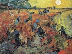
It will be something that expresses summer well. To my mind it is not easy to express summer, as mostly, or at least often, a summer effect is either impossible or ugly; at least that is what
I feel. On the other hand, however, there are the twilight evenings.
But I mean, it is not easy to find a summer effect that is as rich and as simple and as good to look at as the characteristic effects of other seasons. Spring is delicate, green young wheat and
pink apple blossom. Autumn is the contrast of yellow foliage against violet tones. Winter is the snow with black silhouettes.
So if summer is the contrast of blues against an element of orange in the gold-bronze of the wheat, it should similarly be possible to paint a picture that expresses the mood of each season
well, by using in each case the contrasts of the complementary colors (red and green, blue and orange, yellow and violet, white and black).
When you come here, you will find all the peasants busy plowing and sowing spurry, or that may just be coming to an end.
I have seen fine sunsets on the fields of stubble.